It’s 2020 and the digital presence of every business is important especially when your business depends on the website. So, when you create your website for your small business you should be cautious of the small mistakes that can hurt your website design. A small example is ignoring the contact details or not including the information about your business to sound authentic.
To stand stable in the competition, you need to avoid these gaffes to keep your website ruling in the competition.
The Over-Fancy Elements on the Home Page
A visitor takes only 60 seconds to decide whether he needs to stay on your website or not. The home page helps in the decision-making of the customers and your business sales also depend on it. When you try to put everything on your page to everyone, the real objective of your website is lost in the fanciness. Your website has to breathe through the white spaces so it’s important that you keep the balance between the content and the design.

Not Displaying your Contact Information
With the availability of millions of online businesses, it can be really challenging to find the one for you. Customers think a lot before trusting you to hire, especially when you have an ecommerce business. So, you should display your email address, contact details and phone number. Even if nobody ever calls, the information will count in your credibility and add transparency to your website design. Take an example from this web design company Toronto who has put together all the contact details in the footer of the website so customers can easily find and contact them when required.
Broken Links
Broken links broke the credibility of your website. What do you think about the website pages which show 404 errors?
Bad links or broken links hurt the credibility of your website and also impact the search engine ranking. When the search engine crawler crawls on your website, it considers it as a bane on your web surfer. Keep testing your site and ensure that there’s no broken link on your site. If there’s any then fix those immediately.
Slow Navigation
These days customers don’t show patience to wait for your website to load or navigate. If they can’t find the information on a click, they’ll move to another website or turn off your website. In this context, place a navigation bar on each phase which guides the visitors about the other pages and gives details about the website. Either position the navigation bar on the top of the page or the bottom of the site.
Different Font Styles and Color
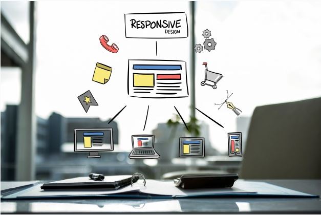
Your website should present uniformity in content, website design, fonts and colors. A variety of colors and fonts turn your website into a mishmash and impact the decision-making of the customers. When you design a website, always ensure that your website looks good from all devices, be it smartphones, tablets, computers or iPhones. The solidity and stability should be consistent on all devices so that it attracts the visitors and doesn’t impact their decision-making.
Not Having a Blog Section
Customers might neglect the leftover blog section but for search engines, it’s highly important. Consistent blogging has many benefits on your brand and also your credibility in the thriving competition. It also makes you an expert in the eyes of the customers and boosts your social network. By having a blog section, you can teach people the tips and tricks of website design, factors that influence the design and can also teach how to make money online by giving web design services to the people.

Outdated Content
Content is the power of your website, the way you write the words conveys your brand values and gives reasons to the customers to trust you. So, you should use the latest copywriting techniques to intrigue the users on the website such as focusing on the headlines, titles, description and highlighting the key features of your product/service.
Using Stock Photos
Stock photos hurt the credibility of your design, it blemishes the worth of your design. So, instead of using the stock photos, go for the original ones which relate to your website mission/vision. It’s important because real photos create more authenticity for your customers and give them reasons to trust you.


